“Tīrraksts”
Personālizstāde galerijā Māksla XO Rīgā
16.10.–06.12.2025
Izstādei “Tīrraksts” veidotajos darbos turpinu attīstīt abstrakcijas un telpiska zīmējuma idejas, veidojot papīra griezumu un akrila krāsas triepienu kolāžas, tā attīstot tālāk 2019. gadā uzsāktās sērijas “Melnās līnijas” uzietos paņēmienus. No “Melno līniju” izgatavošanas pāri palikušās negatīvās formas ir attīstījusies paralēla sērija “Scholē”, veidota no pamtkrāsu laukumiem, kuru arī turpinu izstādē “Tīrraksts”. Izstādes darbi kārtoti divās galerijas zālēs trīs nosacītās daļās. Pirmajā ir izkārtotas melnas līnijas un balti laukumi ar uzsvaru uz melnbalto kontrastu un abstrakciju. Otro daļu veido krāsainu laukumu kolāžas, izceļot pamatkrāsu spēku un negatīvo formu telpisko saspēli, kas atklāj prombūtnes klātesamību. Trešajā daļā ir neliels retrospektīvs atskats uz manu formālo paņēmienu izcelsmi, kā arī zīmējumi, kas atgādina par šī medija nemainīgi būtisko vietu manā praksē.
Izstādes nosaukums norāda uz estētiskajām izvēlēm – tieksmi pēc tīrības, kārtības un skaidrības, kas sabalsojas ar Žila Delēza un Fēliksa Gvatari ideju par māksliniecisko praksi kā stratēģiju cīņā ar haosu. Līnija manā praksē darbojas kā atdalītāja, formu radītāja. Darbi ir grafiski un perfekti izstrādāti žesti, kas atvērti interpretācijai. To veidošanas formālie paņēmieni aicina skatītāju uz afektīvu uztveri, kas brīva no literāriem uzslāņojumiem. Manā praksē būtiska ir vizuālo izteiksmes līdzekļu ekonomija un darbus veidojošo elementu sadarbība, pievēršot īpašu uzmanību materiālu aģencei un grafiskās mākslas pamatelementiem: punktam, līnijai, plaknei, telpai, kustībai. Tāpat manā praksē nemainīgi būtisks ir pašreferences princips, ko veido formālo paņēmienu iekšējā loģika, piemēram, gravitātes izliekti, gravitāti attēlojoši zīmējumi vai pozitīvo un negatīvo formu lietojums.
Līnija manos darbos kļūst par klaiņojošu, brīvu kustību, kas seko iedomātai trajektorijai un atklāj žesta vieglumu un plūdumu. Tā ir atbrīvota no reprezentācijas un literārām nozīmēm, kļūstot par lietu par sevi. “Aktīva līnija pastaigā, brīva kustība, bez mērķa. Pastaiga pastaigas dēļ.” (Paul Klee) Līnija ir ziņkārīga un brīva, tā plūst, vibrē, viļņojas, aug un atslābst, un iezīmē formas, kas atklāj iztēles elastību. Abstrakcija aktivizē skatītāja uztveri un prāts meklē atpazīstamo. Šī interpretāciju daudzveidība un attēla daudznozīmība sabalsojas ar ikdienā novērojamo – viss nemitīgi mainās – gan lietas, ārēju apstākļu ietekmē, gan uzskati, uzkrājoties jaunai pieredzei. Abstrakcijas un atpazīstamā līdzāspastāvēšana palīdz izvairīties no vienas noteiktas nozīmes uzspiešanas. Lakoniskie, diagrammatiskie tēli dod impulsu sajūtām, domām vai asociācijām un ļauj skatītājam pašam veidot jēgu. Skatītājs, balstoties savā pieredzē, ieraudzīs to, ko vēlas ieraudzīt, savukārt mākslinieces izvēle ir – ko izglābt no bezgalīgo variāciju nebūtības un kādā konstelācijā tos kārtot un parādīt citiem.
Veidojot sērijas jaundarbus pieturos pie vienota stila un pieņemu apzinātus estētiskus lēmumus, tiecoties uz skaistumu caur rotaļīgu vienkāršību. Darbi ir ar zīmējuma palīdzību dizainētas sajūtas – apzināti konstruētas, lai panāktu neuzbāzīgas klātbūtnes efektu. Tā ir sajūtu radīšana ar grafiskiem paņēmieniem, rotaļa ar formu un materiālu. Tā vienmēr ir maza skice, kas pārnesta lielākā izmērā un pārcelta materiālā. Šajos darbos savienojas intuitīva spontanitāte, uzmetuma pirmatnīgums un amatniecisks perfekcionisms, kas izpaužas kā totāla kontrole pār mākslas darba izgatavošanas procesu – tajā nav vietas kļūdai vai nejaušībai un notiek mērķtiecīgi virzīta materiālu manipulācija, pēc skaidri zināma plāna. Tiekšanās uz vienāršu skaistumu notiek apzināti pievēršot uzmanību sīkām vienībām, mikro-žestiem, nelielai kustībai. Vizuālās valodas vienkāršība rada vienlaicīgi gan nopietnu, gan nenopietnu iespaidu. Nopiena ir mana attieksme pret darbu, bet nenopietna pret vēstījuma dominanci. Tā ir radikāla vienkāršība un pašpārliecinātība caur rotaļīgumu. Izstādes darbi piesaista uzmanību ar skaistumu un mieru. Minimālā atturība aicina skatītāju iejusties un palēnināt tempu. Šī pieredze nav tematiska, bet apzināti veidots percepts, kas ierosina afektu – sajūtas bez naratīva. Izstādes darbu kopums veido telpu, kurā ir patīkami uzturēties un noturēšanās miera stāvoklī var kļūt par aktīvu pretošanos ikdienas informācijas pārbagātībai, digitālajam parsātinājumam un steidzīgajam dzīves ritmam. Izstāde iemieso ideju par balto kubu un darbnīcu kā telpu kontemplācijai – neparastu vietu, kur apstāties, pievērst uzmanību virsmām, ļauties sajūtām un domām, un veidot jaunu pieredzi.
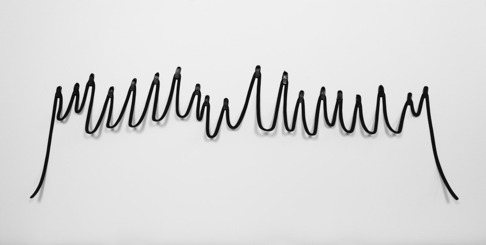
Izstādes darbus var raksturot kā paplašinātu zīmējumu, kur materiālu aģence un elementu sadarbība kļūst par būtisku izteiksmes līdzekli. Katra izstādes darba pamatā ir zīmējums un manā gadījumā paplašināts ir zīmējums, kas iznests telpā, izmantojot papīra griezumu un sagatavotus akrila krāsas triepienus. Man patīk šo materiālu vienkāršums un trauslums un svarīgi, ka savus mākslas darbus veidoju pati ar savām rokām un varu izbaudīt procesu. Ja Anrī Matiss savas kolāžas dēvēja par “zīmēšanu ar šķērēm”, tad mana metode ir “zīmēšana ar skalpeli” – tā nav intuitīva improvizācija, bet gan precīzi izplānotas darbības un manipulācijas, kas iedarbina materiāla vitalitāti. Izgrieztais zīmējums kļūst par mīkstu skulptūru, kas žūstot un reaģējot uz telpas klimatu nemanāmi deformējas, iegūstot lēnu, bet nepārtrauktu kustību. Arī pēc darba pabeigšanas izgrieztais zīmējums turpina nemanāmi mainīties, bet tā pilnība atklājas pateicoties dažādo elementu kopīgai sadarbībai – punkti-triepieni notur trauslo struktūru pie virsmas un neļauj tai sagāzties haotiskā kaudzē uz grīdas, vai citur – tie iezīmē līnijas trajektorijas pagrieziena vietas. Akrila krāsas triepieni atsaucas uz glezniecības vieliskumu – materiālā ierakstītais žests arī pēc nožūšanas saglabā savu sākotnējo slapjas masas viskozitātes iespaidu. Krāsu triepienā ir ierakstīts mākslinieces žests, kas, iespējams, vēl precīzāk un nepastarpinātāk saskatāms zīmējumā. Rokas kustības ierakstā atklājas kaut kas autentisks, dzīvs un brīvs.
Izstādes nosaukums “Tīrraksts” norāda ne tikai uz vēlmi pēc konceptuālas kārtības un skaistā prezentācijas, bet arī uz melnraksta klātbūtni: skices, zīmējumi, meklējumi un plānošana ir neredzamais pamats katrai izstādei un katram mākslas darbam. Tāpēc vēlējos izstādē iekļaut arī kaut ko no sērijas “Melnās līnijas” pirmsākumiem – piecus 2019. gadā Ņujorkas rezidencē tapušus darbus. Artefakti, kas nav veidoti ar nodomu tos izlikt publiskai apskatei, fiksē laiku un apstākļus, kuros radušies, un veido sava veida personīgu prakses arheoloģiju, kā arī atklāj intuitīvu un haptisku jaunrades procesu. Darbs bez iepriekš nosprausta mērķa galu galā ir aizvedis līdz darbiem, kas redzami šeit un tagad, un ļauj izsekot manas šī brīža pieejas un paņēmienu izcelsmei. Tas apliecina, ka ļaušanās procesam var pavērt jaunus ceļus un atklājumus, bet došanās nezināmajā var kļūt par aizraujošu rotaļu. Kļūda kā metode ir raksturīga daudzu mākslinieku daiļradei: tā ir intuitīva darbošanās darbnīcā, ļaujot vienai lietai vest pie nākamās, un apzināta savu formālo ierobežojumu pārkāpšana, tīši ieviešot kādu “nepareizību”. Šajā bezgalīgo variāciju un iespēju haosā mēs paši radām savus noteikumus un izveidojam savu kārtību.
Zīmējumam manā praksē vienmēr ir bijusi būtiska loma. Tas bieži ir pamats materiālā veidotajiem darbiem, kā arī ikdienišķs rokas vingrinājums. Tas var būt process bez noteikta gala mērķa un domāšana darbībā – vēlme fiksēt situācijas, emocijas, idejas. Skiču klade kļūst par liecību it kā nenozīmīgiem ikdienas fragmentiem, kas, notverti uz papīra lapas, paliek nemainīgi, tā ļaujot saglabāt atmiņas un pavērt durvis uz pagātnes ainām. Zīmējums ir domāšanas telpa, kas saglabā atmiņas un palīdz atcerēties.
/
“Fair Copy”
Solo exhibition at Māksla XO Gallery, Riga
16.10.–06.12.2025
In the works created for the exhibition “Fair Copy”, I continue to develop ideas of abstraction and spatial drawing, creating collages of paper cut-outs and acrylic brushstrokes and further advancing the methods discovered in my series “Black Lines”, begun in 2019. The negative shapes left over from producing “Black Lines” have evolved into a parallel series, “Scholē”, made of shapes of primary colors, which I also continue in “Fair Copy.” The exhibition works are arranged across the gallery’s two halls in three conditional parts. The first presents black lines and white shapes, emphasizing black-and-white contrast and abstraction. The second part consists of collages of colored shapes, highlighting the power of primary colors and the spatial interplay of negative forms that reveals the presence of absence. The third part offers a small retrospective glance at the origins of my formal methods, as well as drawings that remind us of this medium’s enduringly essential place in my practice.
The exhibition title points to my aesthetic choices – an inclination toward purity, order, and clarity – which resonates with Gilles Deleuze and Félix Guattari’s idea of artistic practice as a strategy in the struggle against chaos. In my practice, the line functions as a separator and a generator of form. The works are graphic, meticulously executed gestures, open to interpretation. Their formal making processes invite the viewer to an affective perception free of literary overlays. Essential to my practice are the economy of visual means and the collaboration of the elements that form each work, with particular attention to the agency of materials and to the basic elements of graphic art: point, line, plane, space, movement. Equally central is the principle of self-reference, shaped by the internal logic of formal procedures, for example, drawings bent by gravity that depict gravity, or the use of positive and negative forms.
In my works, the line becomes a wandering, free movement that follows an imagined trajectory and reveals the lightness and flow of the gesture. Freed from representation and literary meaning, it becomes a thing in itself. “An active line on a walk, free movement, without goal. A walk for the sake of the walk.” (Paul Klee) The line is curious and free: it flows, vibrates, ripples, grows and relaxes, tracing forms that reveal the flexibility of imagination. Abstraction activates the viewer’s perception and the mind searches for what is recognizable. This diversity of interpretations and the image’s ambiguity resonate with what we observe in everyday life: everything is constantly changing – things under the influence of external circumstances, and viewpoints as new experience accumulates. The coexistence of abstraction and the recognizable helps to avoid imposing a single fixed meaning. Laconic, diagrammatic images spark sensations, thoughts, or associations and allow the viewer to construct meaning. Based on their own experience, viewers will see what they want to see; the artist’s choice, meanwhile, is what to salvage from the nothingness of infinite variations, and in what constellation to arrange and show it to others.
When creating new works within a series, I adhere to a unified style and make deliberate aesthetic decisions, striving for beauty through playful simplicity. The works are feelings designed through drawing – consciously constructed to achieve an effect of unobtrusive presence. They are sensations produced by graphic means, a play with form and material. It is always a small sketch transferred into a larger scale and translated into matter. In these works, intuitive spontaneity, the primal quality of a first draft, and a craftsmanlike perfectionism come together, expressed as total control over the making of the artwork – leaving no room for error or chance and involving a purposeful manipulation of materials according to a clearly known plan. The pursuit of simple beauty takes place through attentive focus on small units – micro-gestures, slight movements. The simplicity of the visual language creates an impression that is at once serious and not serious. My attitude toward the work is serious, but my attitude toward the dominance of message is not. It is radical simplicity and confidence through playfulness. The exhibition works attract attention through beauty and calm. Minimal restraint invites the viewer to settle in and slow down. This experience is not thematic, but a deliberately constructed percept that triggers affect – sensations without narrative. Taken together, the works form a space in which it is pleasant to be, and remaining in a state of calm can become an active resistance to the everyday overload of information, digital oversaturation, and the hurried rhythm of life. The exhibition embodies the idea of the white cube and the studio as a space for contemplation – an unusual place to stop, attend to surfaces, give in to sensations and thoughts, and form new experience.
The exhibition works can be described as expanded drawing, where the agency of materials and the cooperation of elements becomes an essential means of expression. At the core of each piece is a drawing; in my case, the drawing is expanded into space through paper cut-outs and prepared acrylic brushstrokes. I like the simplicity and fragility of these materials, and it is important that I make my artworks myself, with my own hands, so I can fully inhabit the process. If Henri Matisse called his collages “drawing with scissors,” then my method is “drawing with a scalpel” – not intuitive improvisation, but precisely planned actions and manipulations that activate the material’s vitality. The cut-out drawing becomes a soft sculpture that, as it dries and responds to the room’s climate, subtly deforms, acquiring a slow but continuous movement. Even after the work is finished, the cut-out drawing continues to change almost imperceptibly, and its completeness is revealed through the cooperation of its different elements: point-strokes hold the fragile structure against the surface and keep it from collapsing into a chaotic pile on the floor – or elsewhere – and they mark the turning points of the line’s trajectory. The acrylic brushstrokes refer to the materiality of painting – the gesture inscribed in the material retains, even after drying, an impression of wet-mass viscosity. The artist’s gesture is embedded in the brushstroke, and perhaps it is seen even more precisely and directly in drawing. In the record of the hand’s movement, something authentic, living, and free is revealed.
The title “Fair Copy” points not only to a desire for conceptual order and a beautiful presentation, but also to the presence of the draft: sketches, drawings, searching, and planning are the invisible foundation of every exhibition and every artwork. That is why I also wanted to include something from the beginnings of the “Black Lines” series – five works made during a residency in New York in 2019. These artifacts, not created with the intention of being shown publicly, capture the time and circumstances in which they emerged and form a kind of personal archaeology of practice, while also revealing an intuitive, haptic creative process. Work without a predefined end goal has ultimately led to the works visible here and now, allowing one to trace the origins of my current approach and methods. It confirms that surrendering to the process can open new paths and discoveries, and that setting out into the unknown can become an exciting game. Error as a method is characteristic of many artists’ practices: it is intuitive work in the studio, allowing one thing to lead to the next, and a deliberate transgression of one’s formal limitations by intentionally introducing something “wrong.” In this chaos of infinite variations and possibilities, we create our own rules and establish our own order.
Drawing has always played an essential role in my practice. It is often the basis for works made in material, as well as a daily exercise of the hand. It can be a process without a defined end goal, and thinking-in-action – a desire to record situations, emotions, ideas. A sketchbook becomes testimony to seemingly insignificant everyday fragments which, once captured on a sheet of paper, remain unchanged – preserving memories and opening doors to scenes from the past. Drawing is a space of thinking that stores memory and helps us remember.